Sunday, May 4, 2008

And it continues...


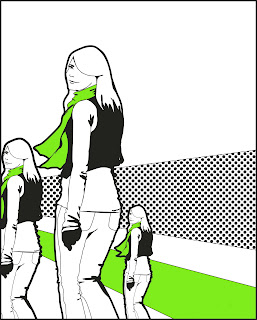
What's this? School is over, and here I am? Yes, indeed. I will continue to post designs and illustrations for your viewing pleasure. Here's to summer freedom!

Sunday, April 13, 2008

Kiss and Make-Up

The aforementioned compilation, in the style of the eerily prophetic Andy Warhol.

Saturday, April 12, 2008

Mucha Mucha


After an insane amount of hours, my self-portrait is finito at last. It's rendered after the image beside it by Alphonse Mucha. I will be posting some lengthy comments on the piece tomorrow as well as the source images. As always, click to enlarge. Good night!

UPDATE: Some thoughts...

I’ll begin with some comments on why I was drawn to Alhponse Mucha’s work to begin with. Quite simply, I think it’s beautiful. It’s illustrative, colourful and romantic. I think it struck a chord with me because it looks like the doodles and sketches I do outside of school or work or anything. Like my sketches, his works are girlie and wistful, and have this kind of Parisian elegance to them. I regards to the style, there are things Mucha does that I do myself – the heavy stroke around the dress and body, the exaggerated drapery, the soft but dramatic shading. The final reason for choosing Mucha is because he was an artist, but a commercial one. He avoids the line between high and low art by simply makes lovely images regardless of whether he’s drawing for himself or for a client. A lot of his work is advertising, but it’s all art.

I chose to imitate this particular image because I love the panel composition and the autumnal palette; it’s rich and very pleasing. Now that I’m looking at the completed image, I’ll be honest – nothing about the woman portrayed is very “Julie”, the face being the only exception. I certainly don’t find myself standing on pedestals robbed in silk and surrounded by floating leaves and flowers that came right out of a 60’s drug-induced vision. This portrait is not a gritty representation of personal emotional turmoil or a realistic portrayal of the spots and speckles in my complexion and the flyways in my hair. This portrait is a representation of some ideal Julie, that can really only exist on a screen. But I’m an idealist at heart, and I think it’s okay for artists to get lost once and a while.

That said, I’m still not completely comfortable with this piece. In a way, it’s ironic that the reason I chose to recreate a Mucha piece was because it was beautiful advertising. As it stands now, I’m almost uncomfortable with applying his rules of beauty and style to a picture of myself – it doesn’t quite fit. I’m not completely at ease with the image of myself as some foreign flower goddess. With that said, the second piece I created for my computer art final, “Kiss and Make-Up” makes perfect sense. It is a Warholian homage that became a commentary on the modern view of women in our air-brushed, celebrity saturated age.

It’s really quite nice when connections create themselves, isn’t it? I’ll po
st that video in just a moment.

Friday, March 14, 2008

(Shameless Plug)

It's getting closer...


This is the story of your red right ankle...

We were asked to play primarily with text last class. We chose a lyric, poem, or phrase that we particularly liked, I chose this song, and created the text-interpretations below.

Wine and Cheese

A layer assignment from a few weeks ago. Nothing too extraordinary.


Wednesday, March 12, 2008

500 Years in 2:52 Minutes

A friend of mine shared this video with me a few months ago, and yesterday we watched it again as a class in Computer Art. One of our final assignments is to pick a portrait, and then use Photoshop to create a self-portrait of ourselves in that likeness. Well, even though we didn't have to choose from the video, immediately upon viewing it yesterday there was one image I knew I wanted to imitate. I failed myself as an art major because couldn't place the image with an artist. So, did a little poking around online and discovered that the images that appear 2:26 minutes into the video are by Alphonse Maria Mucha. His work is absolutely incredible, and I've been pouring over it all morning. I only need to choose a particular work to model my portrait after, and I'll be on my way. As for now, I'm off to the Print Studio.

Friday, March 7, 2008

Jersey Kids

More photo-restores. This time, I worked with a photo of my dad, my grandpa, my uncle Will, and my aunt Ellen. Notice, though, I had to sculpt my uncle Will's face out of my my dads, using the clone brush primarily. Quite the challenge! I'm not a big fan of the colourization on this one, but it's a neat look I suppose.


Thursday, March 6, 2008

Story Time

Apologies for the lack of new content as of late. Though my blog doesn't suggest it, things are running along quite smoothly in regards to my Senior Exhibition. Expect a catch-up post next week.
In the meantime, here is a photo-restoration I've been working on as of late. Uncle Jerry, Mother Dearest, and Aunt Milly. Cute eh?


Tuesday, February 12, 2008

Hi Mom

For the sheer fun of it:
My mom (on the right)

And, the Back to the Future edition.

Sunday, February 3, 2008

I'm not home, but my shoes are. Leave them a message.

This week in Computer Art, we were asked to create a logo from a pre-existing image and the vector tool. I selected this water colour painting I did last year:

I created this drawing of the shoe using the path and vector tools:

I thought this version was a little lackluster, so I incorporated the palette from the original painting, and "logo-ized" it. If I weren't already 6ft, I'd happily sport these pumps all over town.

Saturday, February 2, 2008

Name it, rate it, tune it, print it...

Well! It turned out to be quite the day for me and my little sister. I attended the t-shirt silk screening workshop at the Print Studio on James Street North earlier today, and I couldn't have wished for better results. I was a novice when in came to silk screening, so I was rather nervous about my first go at it. Thankfully, the instructor was incredibly helpful, and the six hours flew buy. It's a time-consuming, rather laborious process, and there are quite a few little steps that you have to time just right, yet somehow I came out of there with five shirts and the confidence that I may actually have something to show in my senior exhibition. Now that I have the basics down, I have to set up a routine with the team over at the studio that will allow me some time between now and April 4 to print my tees under the supervision of their resident silk screen technician. I'll be sure to update this post with some pictures later on tomorrow. Six hours well spent.

UPDATE: Behold! Les t-shirts. I printed two designs on five shirts, here are the ones that worked out the best. Thanks to Laura for being my faithful silk-screening minion and lovely t-shirt model.


Wednesday, January 30, 2008

Wish I'd thought of this

This is pure genius.
Thanks, Annie :)

Friday, January 25, 2008

I Wanna Hold Your Hand

Aloha. Here, we have another computer art assignment. It's my first complete digital painting, and I love the way it turned out. A series of happy accidents turned this:

into this: (click to enlarge)

Have a wonderful weekend all!

Friday, January 18, 2008

Me, Myself and I


The fun thing about this blog is that I can waste away all this time like usual, and then post the results here and somehow convince myself I've been productive. Genius! Here, some portraits. The pop artist in me took over again. Send me some pictures of you and maybe I won't have to alter my own face anymore. Bah!

Thursday, January 17, 2008

Back to Basics


It's been far to long since I've painted in Photoshop, and I've missed it! So, instead of photo manipulation and filters, in this weeks class we were asked to create an abstract image using two colours and the brush tool. I got reacquainted with my old friend the smudge brush, and we got along quite nicely. I also cropped and recoloured the image below, an interesting triptych I'd say.

Wednesday, January 16, 2008

Some thoughts...

I think it's about time I lay down some of the thoughts I've had for senior exhibition. I'm meeting with my professor tomorrow, but it can't hurt to get the ball rolling. So, for some background information: The final culmination of an art major's four years at Redeemer is in most cases a senior show in Redeemer's gallery, to showcase a particular medium or theme that a student wanted to engage. I've already seen my friends and colleague's use this opportunity as a wonderful way to give a sense of conclusion and celebration of their time as an undergrad. While it's an optional choice, I decided way back in first year I'd like to hold my own showing.

I've toyed with a variety of ideas, and thrown just about all of them out the window. I've gone from wanting to do gesture drawings of everyone I know actually considering doing strictly oil still-lifes (I'm still not sure why.)

The closer I get to the "working world" that awaits me come the month of May, I become more and more convinced that my future lies in the world of graphic design. It's the only thing I'm consistently passionate about. When I first share this goal with friends or strangers, they smile, wish me luck, and warn me about the "dangers" of the advertising world that often goes hand in hand with the world of design. Such reactions are exhausting, and contrary to my own worldview.

People are dualistic by default, and would like to keep advertising and design away from what is actually deemed valid art. Obviously, I'd be the first to agree that the realm of design is distinct from other modes of artistic activity, but every kind of art serves it's own distinct function, and isn't lesser for it.

In keeping with this simplistic dualism, Christians in particular are wary of making bedfellows out of faith and advertising. This is the stereotype I'd like to explore, if not debunk. After entertaining a variety of ways and means to do so, I landed on a very simple solution that would not only give me a platform for asking these questions, but would be great FUN.

I want to design t-shirts. I want to suggest that Christians can, and perhaps should, be comfortable with connecting faith and fashion. I want my designs to subvert the already overactive t-shirt culture. This is in an industry that is booming with all sorts of individual creativity, aimed directly at overwhelmed 20-somethings, brimming with talent and wit. Look no further than threadless.com to see what I mean.

Now that I've made it to this point, I've toyed with some names for my "line" of t-shirts. See, not only am I creating a show, but I'm attempting to also establish a brand. After passing on some overly cheeky options (like Christiana-TEES), my mother actually helped my map out the name that seems just right. After thinking about my own name, and the ideas I want to convey, she suggested "Jubilee". After that, she narrowed it down to "Jubal". I took to it immediately. Not only because "Jubal Tees" has that perfect ring, but because the Biblical origins of the name resonate with me. Jubal, mentioned in Genesis 4:20-21 is the first musician mentioned in the Bible. "Jubal, the father of all who played the harp and flute".

I could say more on this, but I have plenty of time for that later. For those of you who have stuck with me for the duration of this blather, soon I'll give you something to look at rather than read. Logos will be up tomorrow morning. Night!

UPDATE: Here they are. Let me know which ones you like ;)


Tuesday, January 15, 2008

I Want to Wake Up in the City that Never Sleeps

So, come February reading break, I will be making my triumphant return to NYC with the art department. I seriously, seriously, cannot wait. We had our first meeting, and I'm already mapping out how to fill each day. I fell in love with the city after traveling there with my family last fall, and I'll take any excuse to go back. In eager anticipation, I took some photos of my sister Laura (image 1) and myself (image 2), and had a little fun. Like usual, click for the full size image.


Thursday, January 10, 2008

Haute Couture

Greetings,
As the others in my Computer Art Class are well aware, we were given our first assignment in class. The instructions were open-ended, allowing for a variety of concepts to be explored. We needed to combine two pictures, incorporate text on a path, use the shape tool, and of course tinker around with filters. Since I am already quite familiar with most of the tools, I decided to create a little series. Lacking inspiration, I poked around VOGUE.com and came across Christian Dior's latest collection, and these three post-cards are the result. I suppose, without meaning to, I established a mock ad-campaign for these dresses. High fashion on the streets of Paris? It's a perfect fit, really.


Thursday, January 3, 2008

1234...

testing testing